
01 — Portfolio Archive
Brand Identity & Logo
A collection of case studies showing how concepts, sketches, strategy, and applications come together as identities with a reason to exist.
Move the cursor to area of logo
Core Concept: "PA" Monogram as a Symbol of Excellent Service
The Prima Apparel logo is built by fusing the brand's two initials P and A into a single, continuous, fluid monogram. This isn't just a simple letter combination; it's a visual metaphor for the philosophy of "prima" (excellent) service itself: something seamless, consistent, and unbroken from start to finish.
1. Continuous Flowing Line
The P is rendered as a ribbon-like, uninterrupted stroke, curling like fabric or a continuous stitch. This represents:
The apparel/textile industry (visually echoing thread, fabric, and stitching)
An unbroken chain of service from production all the way to the customer
The brand's flexibility and adaptability in meeting market needs
2. Two Colors, Two Values
Crimson Red — dominates the P and A forms, symbolizing energy, boldness, and a strong commitment to premium quality. Red is also psychologically tied to passion and dedication to high standards.
Golden Yellow — appears as an accent bridging the P and A. This color represents premium quality, warmth of service, and the added value that defines the word "Prima" itself meaning excellent or first-rate.
3. The Golden Accent as a "Touch of Excellence"
The yellow shape weaving through the letterforms isn't purely decorative it symbolizes the extra value or personal touch that sets Prima Apparel apart from competitors. Its position at the exact junction of P and A reinforces the idea that excellence lives in every detail, at every point of customer interaction.
4. Wordmark Typography
"PRIMA APPAREL" is set in a bold, rounded sans-serif, conveying:
A modern, professional feel
Approachability friendly rather than rigid, echoing warm service
Clear visual hierarchy: "PRIMA" as the dominant brand name, "APPAREL" as the supporting category descriptor
Summary
Altogether, the logo tells the story of a brand that places excellent service at the heart of every product expressed through a seamless flowing form, purposeful color meaning, and a golden thread of excellence woven through every stitch.
Core Concept: A Dual-Letter Monogram Representing Divine Precision & Automotive Speed
This logo merges two initials D (Divine) and S (Speed) into a single architectural monogram that captures both the discipline of engineering and the raw energy of motion. As an automotive technology brand mark, the design speaks to precision, power, and a level of performance that feels almost transcendent — hence "Divine."
1. The Bracket Frame — Structure of Divinity (D)
The outer bracket-like square frame forms the letter D, constructed from clean, geometric right angles. This structural framing represents:
Engineering discipline and technical mastery the "Divine" order behind every mechanical system
A protective enclosure, symbolizing reliability, safety, and precision manufacturing
Stability as the foundation from which speed and performance are unleashed
The open corners of the frame — where the square doesn't fully close suggest motion breaking through structure, as if speed is escaping the boundaries of the frame itself.
2. The Flowing S — Velocity in Motion (Speed)
At the center, the letter S is rendered as a continuous, curvilinear ribbon, doubling as an abstract silhouette of a sports car in profile front curve as the hood, the sweeping midsection as the cabin line, and the tail as an aerodynamic rear. This conveys:
Fluid motion and aerodynamic speed
The negative-space technique (S formed by negative space within the D) reflects sophistication and clever visual engineering — mirroring the ingenuity behind automotive technology itself
The double-line accents (speed lines) at the top and bottom-left of the S reinforce a sense of velocity and forward momentum
3. Negative Space Mastery
The interplay between the solid blue bracket and the white negative space forming the S is the logo's most sophisticated element it demonstrates that this brand isn't just about raw power, but about intelligent design and technical elegance. This duality (structure vs. flow, order vs. motion) mirrors the brand promise: divine engineering delivering supreme speed.
4. Color — Royal Blue
The deep royal blue conveys trust, technological sophistication, corporate reliability, and a premium, forward-thinking identity commonly associated with innovation-driven automotive and tech brands.
Summary
Together, the bracket (D/Divine) and the flowing silhouette (S/Speed) form a single unified emblem: structured precision giving birth to unrestrained velocity a mark built for a brand that treats engineering as an art form and speed as its ultimate expression.
Core Concept: An Interlinked Cloud Symbolizing Connected Storage & Seamless Data Flow
The Cloudy logo transforms the familiar "cloud" icon often used generically in tech branding —into something distinctive by constructing it from three interlocking ribbon-like loops. Rather than a flat, static cloud silhouette, the mark becomes a dynamic system of interconnected nodes, directly reflecting the core function of a cloud storage/server startup: linking, syncing, and securely connecting data across a network.
1. The Cloud Silhouette — Familiar, Yet Reimagined
At first glance, the overall shape reads instantly as a cloud a universally recognized symbol for cloud computing and storage. This familiarity ensures immediate category recognition. However, instead of a single, solid, monolithic form, the cloud is deconstructed into three separate looping ribbons, transforming a passive icon into an active, structural one.
2. Interlocking Loops — The Chain-Link Metaphor
The three colored ribbons (blue, magenta, and amber) interlock like chain links or puzzle pieces, weaving through and connecting with one another. This is the logo's central philosophy:
Interconnectivity — representing how data, devices, and users are seamlessly linked within the cloud infrastructure
Redundancy & reliability much like a chain link system, if one node connects to another, the network remains strong and unbroken, symbolizing uptime and data security
Modularity — each loop can represent a distinct service or node (storage, compute, sync) that works independently yet functions as one unified system
3. Three Colors, Three Pillars
Sky Blue — trust, clarity, and the openness of cloud access; often associated with technology and digital reliability
Magenta/Pink — innovation, creativity, and a modern, energetic brand personality that sets Cloudy apart from conventional enterprise-blue tech brands
Amber/Gold — warmth, optimism, and premium value suggesting that behind the technical infrastructure lies a service built with care and quality
Together, the three-color system suggests a multi-layered service ecosystem (e.g., storage, sync, and security) working in harmony no single color dominates, reinforcing the idea of balanced, distributed infrastructure rather than centralized control.
4. Negative Space & Rounded Forms
The thick, rounded ribbon strokes with soft terminals give the mark an approachable, friendly quality softening what could otherwise feel like a cold, purely technical service. This humanizes the brand, making enterprise-grade cloud technology feel more accessible to everyday users and small businesses alike.
5. Wordmark
"CLOUDY" is set in a bold, rounded sans-serif in deep purple/navy grounding the playful, colorful icon with a stable, trustworthy typographic anchor. The rounded letterforms echo the loop shapes above, creating visual consistency between icon and wordmark.
Summary
The Cloudy emblem reframes a common cloud-tech cliché into a symbol of active connection three interlocking ribbons forming a cloud silhouette that visually narrates the brand's core promise: secure, seamless, and colorfully human cloud infrastructure that links everything together.
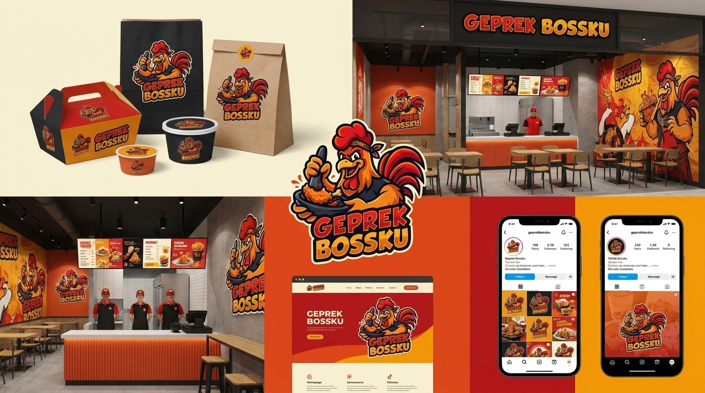
Core Concept: A Bold Rooster Mascot Embodying Confidence, Spice, and Street-Food Authenticity
The Geprek Bossku logo takes an unconventional yet highly effective approach for a fried chicken (ayam geprek) brand instead of depicting a passive food illustration, it personifies the product itself through a rooster mascot, creating an instantly memorable, characterful brand identity that stands out in a crowded culinary market.
1. The Rooster Mascot — A Clever, Self-Aware Twist
Using a rooster (the source of the chicken product) as the brand's mascot is a deliberate and playful design choice it's a self-referential mascot technique commonly used in successful food branding (similar to how fried chicken brands worldwide use chicken characters). This creates:
Instant category recognition — customers immediately know this is a chicken-based product
A memorable, humanized brand personality customers can connect with emotionally
A touch of humor and confidence, since the rooster is depicted actively "endorsing" and enjoying the very product made from its likeness reinforcing pride in quality ("Bossku" "my boss," implying supreme confidence in the product)
2. Pounding/Grinding Action — The "Geprek" in Motion
The mascot is shown mid-action, gripping a mortar and pestle (cobek/ulekan) the traditional tool used to smash and season geprek chicken with sambal. This visual storytelling element:
Directly illustrates the cooking technique that defines the "geprek" style (crushed, spicy fried chicken)
Adds dynamic energy and movement, making the logo feel alive rather than static
Reinforces authenticity signaling handmade, traditional preparation rather than mass-produced fast food
3. Bandana — Street Food Character & Approachability
The rooster wears a bandana on its head, a visual cue commonly associated with street-food vendors, home cooks, and hardworking food warriors. This detail:
Builds relatability and a "hands-on cook" persona
Suggests dedication, hustle, and craftsmanship behind every plate served
Adds personality without relying on generic chef-hat imagery, keeping the brand feeling local and grounded
4. Confident Facial Expression
The sharp, determined eyes and open, energetic beak expression project confidence, boldness, and spice-driven intensity mirroring the fiery sambal flavor the brand is known for. This isn't a cute, passive mascot; it's an assertive character that matches the "Bossku" (boss) branding, implying top-tier quality and dominance in the geprek category.
5. Color Palette — Fire, Spice, and Appetite
Red & Orange — dominate the mascot's comb, wattle, and tail feathers, evoking fire, spiciness (chili/sambal), and appetite stimulation colors scientifically proven to trigger hunger and urgency
Black — used in the mascot's vest/apron and outline work, adding boldness, contrast, and a premium, modern edge that keeps the logo from feeling purely cartoonish
Golden Yellow — used in the feathers and wordmark, symbolizing crispy, golden-fried texture and warmth
6. Wordmark Typography
"GEPREK BOSSKU" is rendered in a bold, jagged, dynamic display font with thick black outlines and a slight diagonal tilt conveying energy, street-food boldness, and impact. The distressed/angular letterforms mimic the texture of crispy fried skin and add a rugged, appetite-driving visual punch.
Summary
Together, the fiery rooster mascot, the mortar-and-pestle pounding action, and the bold typographic wordmark form a cohesive brand story: Geprek Bossku isn't just selling fried chicken it's selling confidence, spice, and street-hustle authenticity, embodied by a mascot proud enough to call itself "the boss."